Economic and Financial Market Update: When Too Much Data Is Barely Enough
Summary:
• The participation rate is near a record high;
• That is another sign that the labour market has done well;
• Two of the big trends has been rising female and older worker participation;
• And both of those trends could have further to run.
Economics is an occupation with no shortage of data. GDP, CPI, the unemployment rate all goes into the mix to help determine how the economy is running. Another piece of data economists watch is the participation rate (the number of people who either have a job, or are looking for one, as a proportion of the total population over 15). Economists watch the data for both demand and supply reasons.
The demand reason is that the participation rate provides another indication of the current strength of the labour market (people are more likely to look for a job when they can get one). The supply reason is that how many of the population that want to work partly determines how strong the economy can grow. The participation rate can be influenced by the current state of the economy, as well as labour market regulations and the structure of income tax and welfare payments. The age composition of the population also matters (an aging population is likely to mean a lower participation rate).
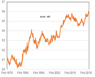
Over recent decades the participation rate has been trending up, and is now at a record high. A strong labour market creating plenty of jobs is one reason. Another is that the slow wages growth means that some households need more income earners.
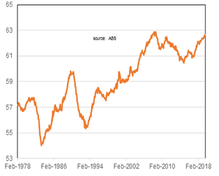
A related measure is the employment to population ratio: the proportion of people with a job to the total population. This measure can be impacted by not only the age composition of the population (less people will be employed if the population has a proportion of young or old) but the unemployment rate. That ratio has also been picking up over recent years and is close to a record high.
National Participation Rate
National Employment To Population Rate
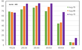
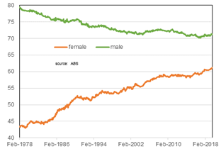
Apart from the young (15-24 year olds), participation rates have been rising across age groups over the past forty years. A key factor has been the substantial rise in participation rates by women in the labour force over the past forty years. This has mainly reflected that more women want to be in work. The increasing flexibility of work (the ability to work part time or from home) has helped. And the need to increase household incomes to meet rising household debt may have historically played a role. Female participation is now around 10 percentage points below male participation rates across age groups (forty years ago it was well over 30).
There was a (gradual) decline of male participation although that appears to have plateaued (and there has been a cyclical increase over recent years). The decline may have reflected an aging population (more workers entering age groups with lower participation). The changing structure of the economy impacting traditional male-dominated industries (manufacturing) may also have played a role.
Another change is the notable rise in participation of older age groups (older than 55). The RBA suggests that a variety of factors have played a part: people live longer, there has been an increase in the pension eligibility age, improving health and rising service sector employment (so less manual labour). Participation rates amongst 55-64 year olds is now approaching that of those in the traditionally ‘prime’ working ages (25-54).
The exception to the trends is the 15-24 year old group. Unlike the other age groups female and male participation rates are about the same. It is also the only age group where participation rates have not risen over the past ten years. Mainly this reflects more people going into higher education. Interestingly, while female participation has been rising for 20-24 year olds it has been falling for males.
Participation Rates By Age
Participation Rate By Sex
Selected Participation Rates

Participation Rates By Sex & Age

Australia participation rate is relatively high by OECD standards. Five countries have a participation rate higher than 70% (Israel is above 80%!). Global comparisons suggest that the trend rise in female and older worker participation could have further to run in Australia. Female participation in Australia is in the top half of the OECD, although well below the rates in Israel, Sweden and Switzerland. The proportion of 55-64 year olds in the Australian labour force is only a little above the OECD average, and well below the proportion seen in Israel, Sweden and New Zealand.
Participation Rate In OECD & Other Selected Countries
(2018, or latest year)

Change In Jobs By Industry
(differences Sept 2009-19)

Female Employment Rate In OECD & Selected Countries

Employment Rate 55-64 Year Olds In OECD & Selected Countries

The participation rate currently being at a record high is a sign that the labour market has been doing well. And the trend rise in participation has helped sustain the economic momentum over the longer term. Some data is more important than others. For long-term economic performance, the participation rate is one of the important ones.
We live in interesting times!
Peter Munckton - Chief Economist